This was a project created from the Design Illustration Techniques II course at Kent State University.
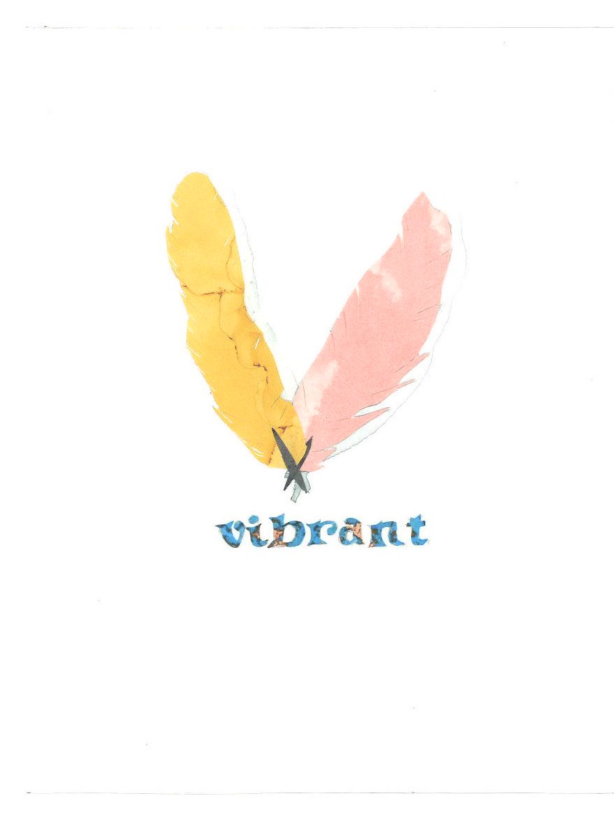
V for Vibrant
The goal for this project was to create an illustration of two pages from an illustrated children’s’ alphabet book. For my design, I chose to use the word “Vibrant.” When thinking of the unique word, I tried to view it for the attended target audience, children. When I thought of the word “vibrant,” I thought about the parrot, more specifically, the scarlet macaw. With the colors in this piece, I was inspired by the bird’s unique and vibrant triadic color scheme.
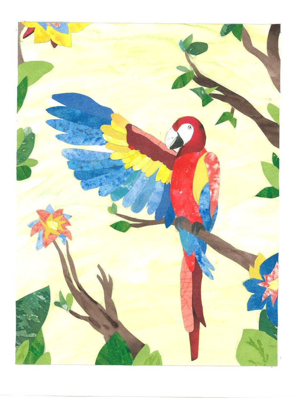
For this traditional illustration, I created a collage using an assortment of pieces of painted cut-outs as well as scrap book paper cut-outs. For the painted cut-outs, I used both watercolor and acrylic paints. After the original sketch was laid out, I used tracing paper, and carefully cut out, and pasted each piece to create a captivating image of the parrot. I also created a page prior, showing the letter “V” out of the created feathers. Each part of the first page showcased each color of the triadic color scheme.